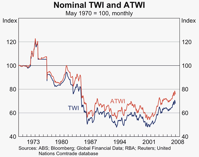
A bilateral graph shows two correlated data sets on one graph. A bilateral graph uses the same X axis and Y axis to organize both data sets so they can be compared easily. Each data set has a differentiating factor like a different color as well as a key to distinguish both data sets. They be similar data, but they are independent of each other while graphed. The image shown above is a bilateral graph effectively comparing the value of the Australian dollar.
No comments:
Post a Comment