Tuesday, July 29, 2014

Climograph


A climograph shows the trend of precipitation and temperature with the progression of time, inches of precipitation occurring and degrees of temperature shown on the X and Y axes. Usually the time scale occurs over a year where precipitation is correlated with temperature. Also climographs can be useful to compare different locations as well as make it easy to see extreme weather events occurring for a particular year for the same location. The image above is an example of a climograph in Boulder, Colorado that shows a relatively weak positive correlation between precipitation and temperature.

Population Profile


A population profile breaks down a country's population with age intervals, male and female distinctions, and shows the amount of people within each interval. Population trends can typically be seen when a population profile is used to show either an unchanging population, an exploding young population or an aging population. On a population profile an unchanging population looks like a rectangle, an exploding young population looks like a pyramid and an aging population looks like an upside down pyramid. The image shown above is an example of the District of Columbia having had an exploding young population twenty years ago where now it is slowly becoming an  upside down pyramid.  

Scatterplot


(scatex.gif on the list)

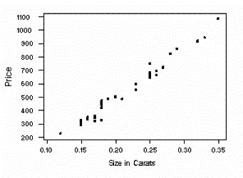
A scatterplot is a type of diagram that displays data on a graph that plots individual data points with the X axis and Y axis. A certain set of patterns can be displayed when all the data points are plotted. If all the points are plotted across the graph with no discernible pattern then there no correlating pattern among the points. If all the points follow closely together from the bottom left of the map to the top right then it shows a strong positive correlation while if all the points are close together starting from the top left towards the bottom right then there's a strong negative correlation. Weak positive and negative correlations are similar to graphs with no correlation where if the points weren't following a strict diagonal direction then there'd be no correlation between the points. The image shown above is a scatterplot that shows a strong positive correlation between the price of diamonds in carats and size of diamonds in carats.

Index Value Plot


An index value plot shows data in relation to a certain index value. The graph doesn't start at zero because the index value is used as the baseline to reference the value along the graph. The index value plot is used because it easily distinguishes when the plotted values go above or below the index value. The image shown above is an example of an index value plot that shows the I.S.M. Non-Manufacturing Index from 1997-2009 with the index value of 50 where the plotted value can be observed to go below the index value during times of recession.

Lorenz Curve Graph


(mid-page)

A Lorenz curve graph shows the actual curve that represents real data from observations that occur in a geometric sequence and an ideal line which occurs in an arithmetic sequence created to show the disparity between the actual curve and the ideal line. Both lines are shown so that disparity can be seen from the idealized line to the actual curve of a specific country at a specific time. The image above is an example of a Lorenz curve graph for South Africa which shows perfect equality as the idealized arithmetic sequence line while the actual percent income curve is represented as the geometric sequence curve. 

Bilateral Graph


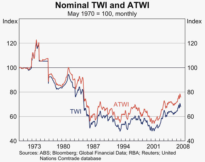
A bilateral graph shows two correlated data sets on one graph. A bilateral graph uses the same X axis and Y axis to organize both data sets so they can be compared easily. Each data set has a differentiating factor like a different color as well as a key to distinguish both data sets. They be similar data, but they are independent of each other while graphed. The image shown above is a bilateral graph effectively comparing the value of the Australian dollar.

Nominal Area Choropleth Map


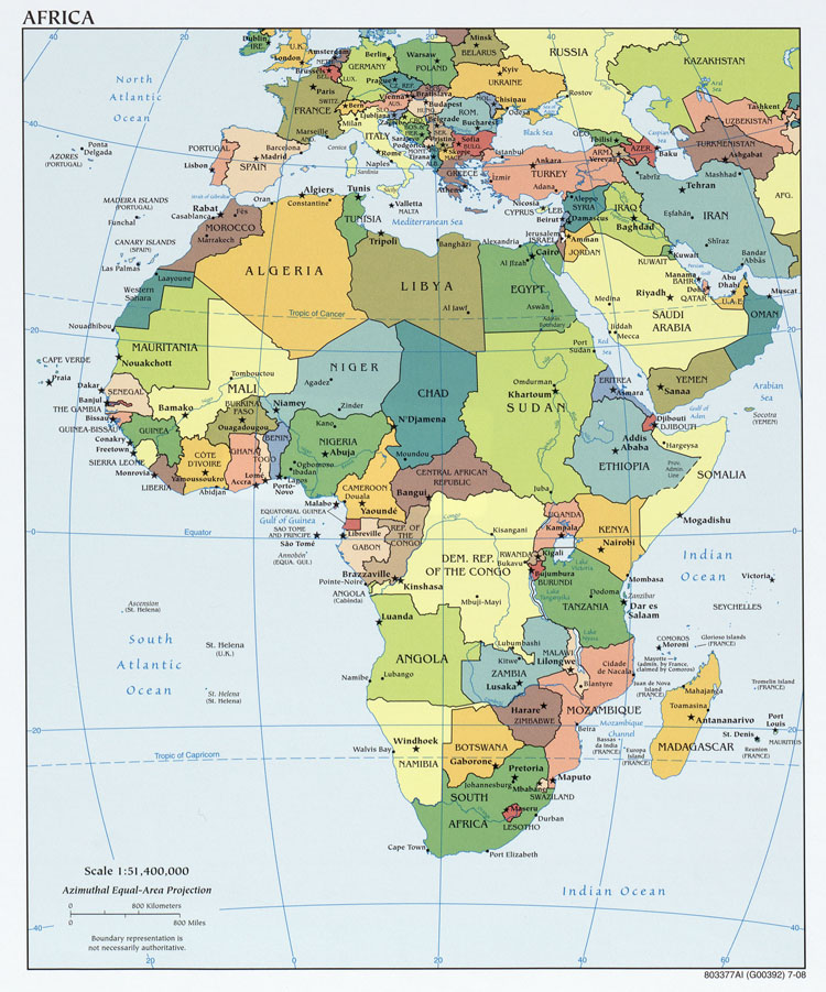
A nominal area choropleth map describes the mapped area's non-categorical qualitative data. A nominal area choropleth map shows the accurate area of the area shown as well as the name of the area as well as any nearby bodies of water as well as latitude and longitudinal lines on the map. A nominal area choropleth map is a descriptive map that shows the agreed upon governmental boundaries on a country and its states. Nominal area choropleth maps do not show statistics, just the qualitative data of the area simplified so it can be shown easily as a reference. The image shown above is a nominal area choropleth map of Africa that gives a qualitative view of Africa without any quantitative data to cover the mapped area.