Monday, July 28, 2014

Isoline Map

(bottom middle hyperlink)
http://www.d.umn.edu/~brant055/catalogue%203532.html

An isoline map describes distributions of a particular variable on a map. An isoline map shows continuous lines joining points of equal value. It is difficult to describe what an isoline map with an example because an isoline map depicts an umbrella of phenomena where specific map types fall under isoline maps. The example of an isoline map above is of suspended dust particles greater than .01 grams per liter of air. I'm not sure if it's an example of an isoline map because it contains similarities to isobar maps, isotachs, isohyets, isopachs and isopleth maps. A map of suspended dust particles is not a map type in it of itself so I think it can be used as a generalized isoline map where lines exist to connect equal amounts of dust in the air across the map.


Proportional Circle Map

(Graduated Circle Map image bottom middle)
http://personal.frostburg.edu/sbriggs0/maps.htm

Proportional circle maps scale the size of circles proportionally to the data value found at that particular location. They simply show that the larger the symbol equals more of the statistical value at a certain location. Proportional circle maps can easily conveys information when the circles are classed and that a key exists somewhere on the map. A proportional circle map without a class key can be confusing and misrepresent the data when the circles have common shapes. The proportional circle map shown above is of Walmart store locations in the United States which has a class key. Information is effectively expressed because the circles vary in size and are shown in an effective range that can be used on the United States size map.

Choropleth Map

(bottom of page)
http://www.geog.ucsb.edu/~jeff/gis/choropleth_maps.html

A choropleth map shows areas by shading or patterning in proportion to the measurement of the statistical variable being displayed on the map. Common choropleth maps use statistical variables like population density or per-capita income. A choropleth map is a simple map type that depicts an average via a graded scale. The choropleth map provides an easy way to visualize how data varies across a geographic area or it shows the level of variability within a region or multiple regions. The choropleth map above is of crime rates in the U.S. overlayed with election results from 2004 above via colored shading.

Dot Distribution Map


A dot distribution map is a map type that uses the dot symbol to depict phenomena across space. The location of the dots can depict spatial patterns when grouped together. A dot distribution map can shown the spread of disease as well as what language is spoken in an area. An advantage of dot distribution maps is that it can easily depict ideas by removing irrelevant detail. A disadvantage of dot distribution maps is that the dot size and spacing can inaccurately depict information depending on how well the map is made. The dot distribution map shown above depicts the advantage and disadvantage of their use. The map easily shows global populations, but also makes it difficult to depict the amount of dots that are shown because the most populated land areas turn the dots almost turn into a type of shading.  


Propaganda Map


A propaganda map is a map with the goal of visualizing propaganda to a world map scale as well as smaller scales. Propaganda maps have the goal of persuasion to depict an outside group as evil and as the group in power as a force for good defending the country. Propaganda maps can be shown as true and false depending on the detail and imagery shown to depict themes of politics, economics and social problems. Propaganda maps are subjective products that market a one sided view of spatial knowledge. Propaganda maps are used because they are widely successful maps that can distort reality in order to sway individuals who share an opposing political view. The propaganda map shown above depicts Russia as a force of good that should expand because it's growing towards several smaller countries that would benefit in becoming part of Russia.

Hypsometric Map

(bottom of page)
http://www.acsu.buffalo.edu/~dbertuca/maps/cat/map-portion-images.html

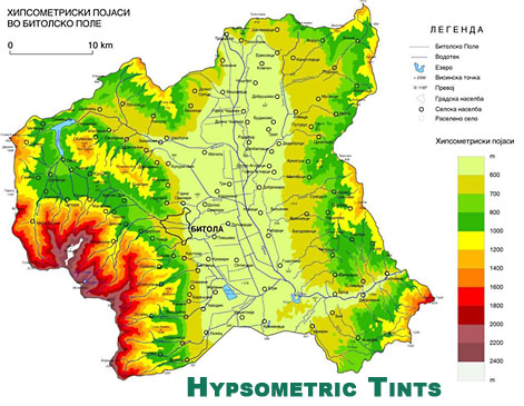
Hypsometric maps or also known as hypsometric tinting use colors to indicate elevation as well as contour lines. They can be used to depict ranges of elevation as bands of color, usually in a graduated pattern or rainbow applied to contour lines themselves. A typical hypsometric map progresses from dark green to lower elevations to yellows and then to white at the highest elevations. Hypsometric maps of land is often accompanied by a similar method of bathymetric tinting to convey the depth of oceans to complete a global hypsometric map. The hypsometric map shown above is not in English, but I can understand it because it has all the features of a hypsometric map where I can understand that the middle of the map is the lowest elevation shown whereas the southwest section of the map is the highest elevation due to the key depicting the graduated color scheme.

Public Land Survey System Map


(mid-bottom of page)
A Public Land Survey System map is a map that shows the subdivision and description of land in the United States after the Revolutionary War in the western part of present day United States of America. All lands in the public domain are altered to fit within this rectangular system of surveys. The Public Land Survey System is a rectangular survey system that divides the land into 6-mile square townships which are further subdivided into 1-mile square sections. This system graphs land so that you can find land easily when each section has their own unique identification. The Public Land Survey System map used above shows the rectangular system in action representing Franklin County in Alabama.